Thursday, February 25, 2010

Kat

what could be a better invitation for a wedding at a ranch? tree like textured paper! i created this invitation for Kat when she told me she wanted something very rustic and different. i made her invitation with all handmade papers, i like the irregularity of handmade products, the imperfections of them made them perfect in my eyes.


 Kat also asked to have leaves as part of her invitation, so i put them right in the spot light, framed with beautiful textured paper.


even raised the frame a little to bring out the texture.


her table menu was simple and to the point in a bright happy sunshine yellow, just like Kat's personality. next to the menu was the tag on her favor - hot chocolate in a jar, sweet!


love all the intricate details of the leaf!

Wednesday, February 24, 2010

double J sneak peek


This is a sample of Joey's invitation to her Spring wedding in the wine country, actual invitation is yet to come! I dont like to post pictures of the invitation until the bride has sent out all her invitations and after most of her guests have received them.


love love love the purple!

Monday, February 22, 2010

short and sweet

yuko asked me to design her wedding invitation with a pair of love bird, she left the rest of the designing decisions to me and only asked for her love birds to be "short and fat".


i designed a boy bird kissing a girl bird on stems of some whimsical flowers


the invitation was letterpressed on a 4.5" x 6.25" 100% cotton cardstock


aren't these birds chubby?


to further the bird theme but to mix it up a bit, i placed the boy and the girl on the opposite side of the rsvp card, it came out adorable.


thank you cards had the same kissing love bird design


always end with my fav line

Monday, February 15, 2010

yellow sunshine girl

After all the wedding projects I have worked on, I am finally working on my own. I never really put any thoughts into what style I would have when I make my own wedding invitation, but I knew from day one that it would be YELLOW and letterpressed.

I wanted something simple, happy and a bit silly, something with ME written all over. So I picked up my pen and did a few designs with circles on my bamboo. My favorite was the one with orangic circles randomly overlapping each other. Henry, my fiance, picked the one that I arranged some polka dots into floating flowers in various sizes. My sister (and my matron of honor) picked the one I did by layering different size and thickness of circles into flowers with stems (she thought they were lollipops).

With so many different opinions swaying me, I absolutely couldnt decide which one to be the final one, so I decided to have them all (wouldnt life be so much easier if we could do that whenever we cant make up our minds?).


I loved the random organic circles, they looked adorable to me :) Or maybe simply because i hand drew each one of them


The polka dot flower design is simple and clean


This lollipop layout is very whimsical.

Which one is your favorite?

Thursday, January 14, 2010

happy holidays

Life has been busy but wonderful since we had our little addition, kammie. She is loved and adored by friends and family, so I incorporated her into my 2009 xmas card. What could be a better way to incorporate her than put her chubby face in an ornament?


I made some paper ornaments and turned them into photo frames. They were fun xmas pattern paper layered with heavy cardstock, then punched out the center for pictures to peep through.


I even had different pictures of Kammie in each ornament.


A silver cap and a shiny hanging thread completed the ornament. Only the body of the ornament was glued to the card, the silver cap and the hanging thread were left hanging. I love how it casts shadow fromt the light.


You can clearly see the thickness of the ornament, it helps the ornament pop from the white backdrop.


To celebrate the holidays, even my sheepie dressed for the occasion :)

Wednesday, November 18, 2009

thank ewe

a black sheep with fluffy white fur is exactly what a sheep lover is looking for when shopping for her baby shower thank you cards


tiny irregular cubes of felt were layered on to mimic real sheep fur texture, to further bring out the cuddliness of the sheep, its face and legs were left in black.


a simple boarder was added to draw attention to the focal point - the sheep

Tuesday, November 17, 2009

Jojo

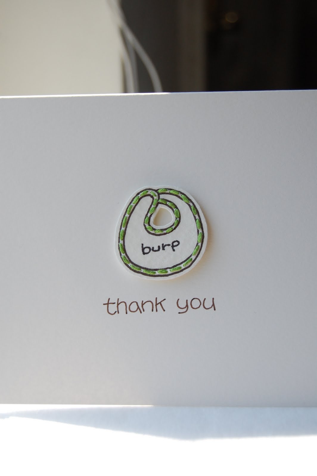
I enjoyed every minute of creating this thank you card for a yellow and green theme baby shower, the mother-to-be adores things simple yet elegant, so a card with a bib taking center stage couldnt be more perfect for her.


The card itself has a smooth finish, but the bib has a rough texture, which made white layered with white anything but borning


bib's trim was finished with sage green thread, hand sewned!


"thank you" written in brown ink for a softer look than black ink


name of my workshop letterpressed on the back of the cards


cards (a set of 20) with envelopes wrapped in yellow to continue the theme color and to add a little personal touch.